Back to The Webinar Series Vault
A Better Coaching Website

October 17th, 2019
Hosted by John
Hosted by John
Highlights:
| 02:12 | DIY Marketing for the Win |
| 06:18 | Words that resonate, Visuals that resonate |
| 13:27 | Mapping out your Customer Perspective |
| 19:17 | Writing from the Customer Perspective |
| 24:10 | Adding Visuals that resonate |
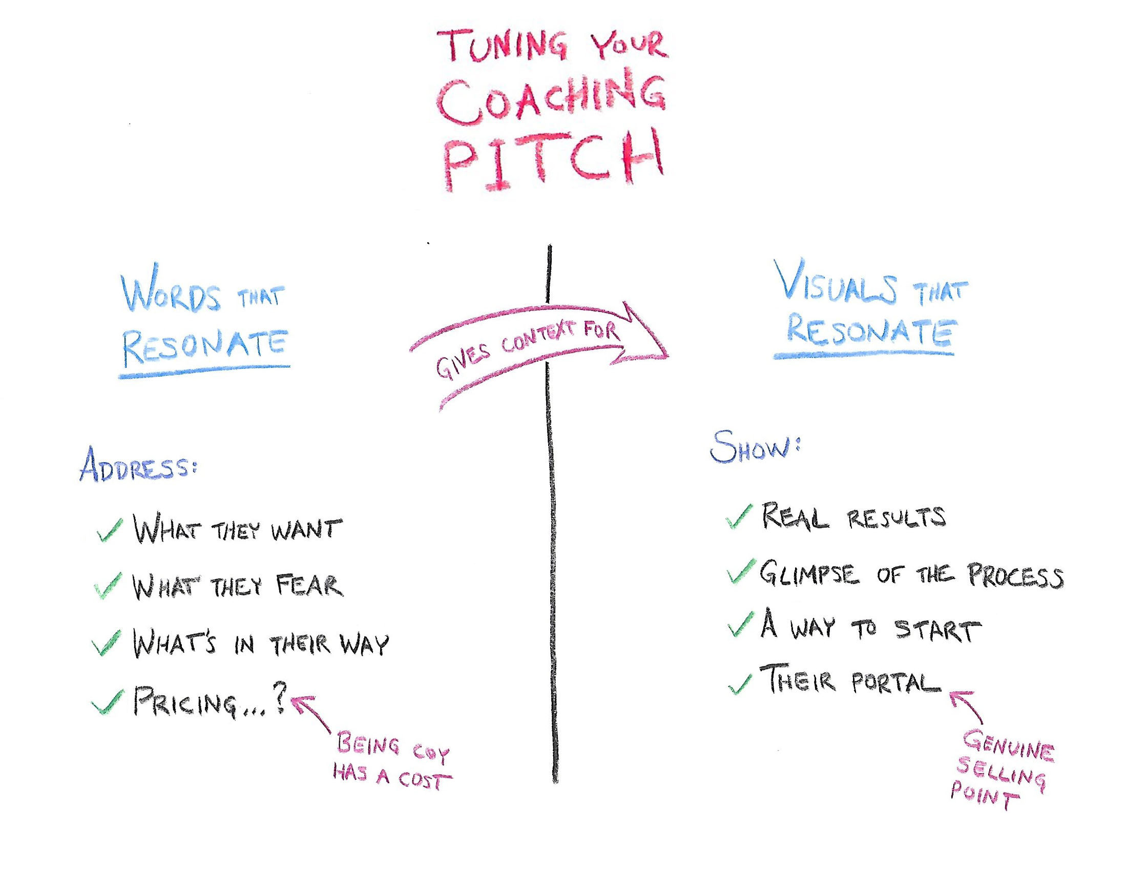
| 33:06 | Tuning your Coaching Pitch |
| 43:34 | The funny thing about credentials |
Your coaching website (and, more broadly your coaching brochure, pitch deck, and other marketing materials) should leave people thinking "Wow, this looks really great and I want to work with them."
In this webinar we go over some things you can do to have the outward appearances of your coaching looking their best, including how CA can give you an edge that sets you apart from the more ordinary.
Warning: This lesson goes a little out of the usual bounds of using CoachAccountable, including a lesson on copy writing.
The good news is that it's easy to do AND high-impact (we at CoachAccountable managed a sustained 60% increase in signups from the ideas presented).
Follow along with the sample coaching website
Here's the high level map of the process covered to tune your coaching pitch:

Like what you hear? Learn more how CA serves your work.

Deliver better programs. To more people. With less work.
© CoachAccountable, LLC. All rights reserved.
CoachAccountable is lovingly crafted in Denver, Colorado by some guy.
CoachAccountable is lovingly crafted in Denver, Colorado by some guy.
