Courses allow you to automate the delivery of coaching materials and assignments, either as a slow drip over a multitude of days, or as an interactive sequence wherein completing the current step leads you to the next (allowing clients to work through the course in self-paced fashion).
Built from items of various types, these types correspond to how the system is organized for clients: Actions live in a client’s Actions tab, files live in a client’s Files tab, and so on.
This siloed grouping of course items (by type) generally works fine for clients to work through a course: one’s attention is usually on just one item, and prompts to move on to the next one allow you to jump you right to it. But then afterwards there’s not really a place for one to go view the course in its entirety: one can easily view the parts, but not see them as a sequential whole.
Here’s where Course Pages come in.
By designing your course to be broken into one or more sections, and adding in static content (content that augments the more interactive bits like Actions and Worksheets), Course Pages become an alternate way for your clients to elegantly view and work through your course material.
Enabling Course Pages for a given Course
To make a Course geared for Course Pages, the first step is to enable it. Because a Course Page is ultimately a way for your clients to see the course they are in (rather than merely receive the course items in an automated fashion), properly setting the Visibility of a Course is necessary.
 When set to “Totally hidden from participants”, Course Pages necessarily can’t apply. By setting Visibility to one of the other two options, you are then given the option to enable Course Pages.
 Building a Course that’s geared for Course Pages works just like the conventional way. As always, you have your complete timeline (days or steps) on which you drag your various items: Actions, Messages, Whiteboards, Worksheets, and so on.
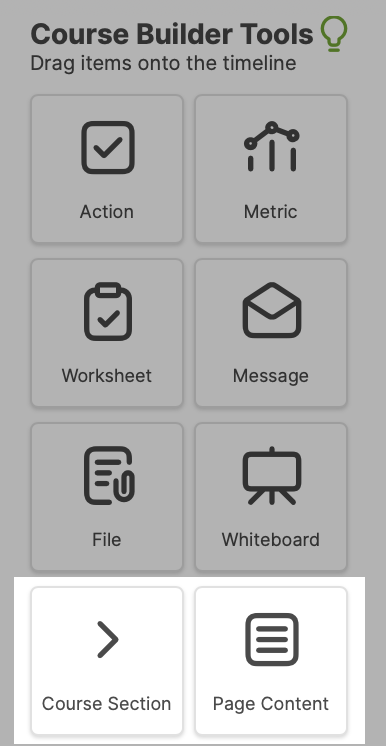
However, in addition to those usual items, when Course Pages is enabled, you have two more that you can drag onto your timeline: “Course Section” and “Page Content”.

Organizing Course Pages into Sections
Course Sections are the key element of organizing the content of your course into a Course Page display.
When you add a Course Section to your timeline (and give it a name), that’s your way of telling CA that “Everything that follows this item should appear within this section”.
When you add another Course Section item later in the timeline, that means you’re ending the previous section and starting a new one: again, everything that follows THAT item will appear under that section.
By adding several sections along the span of your timeline, you are essentially chopping up your Course into those sections. To think of it the other way, adding items between those section items amounts to you building up the content of those sections.
If you don’t add any sections at all, that means the Course Page view of your Course will be completely empty.
Stemming from the same logic, any items of your Course that PRECEDE the very first Course Section will simply not appear anywhere in the Course Page view. (This can actually be a handy and desirable thing… just make sure you actually mean to do it!)
Augmenting Course Pages with Content
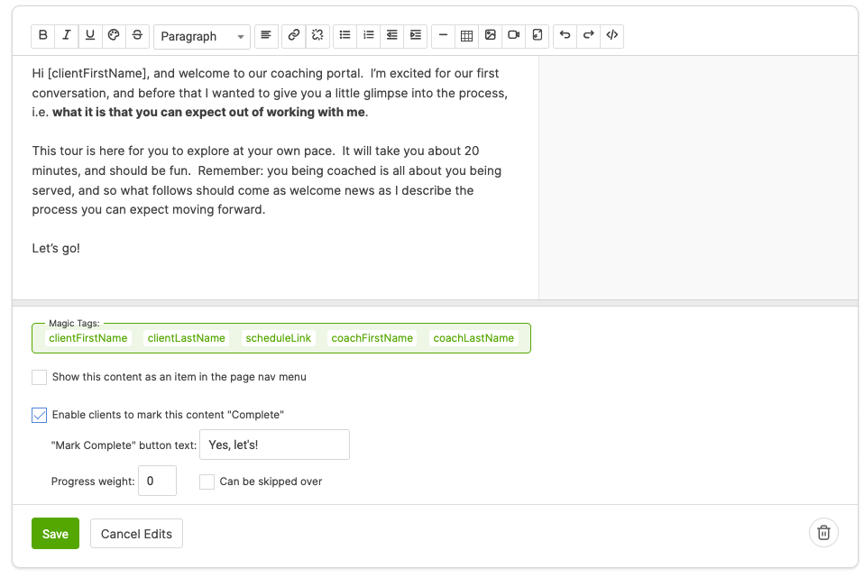
By dragging Page Content items onto your timeline, you can add arbitrary content (complete with formatting, images, embeddable media, and so on) to be part of what displays when clients view your course.
Adding content in this way is an excellent way to intersperse instructions, lessons, and other discussions about the more interactive bits that Courses are comprised of.
For example, you can present a descriptive preamble that tees up an action item, or a lesson upon which a client will be reflecting in a subsequent Worksheet.
